Woodland Sanctuary.
Nature meets luxury.
A visual identity that communicates luxury, serenity, and timelessness - nature meeting flawless hospitality.
Industry
Luxury Hospitality
Services
Brand Identity
Visual System
Project Outcome
Elevated Identity
The Problem
Premium experience.
No visual authority.
Woodland Sanctuary needed a visual identity that communicated luxury, serenity, and timelessness - positioning them as a premium refuge where nature meets flawless hospitality.
Without a refined brand system, they risked being perceived as just another nature retreat. The identity needed to command premium pricing and attract a discerning clientele who expect sophistication at every touchpoint.
What We Built
Gold on black.
Luxury whispered.
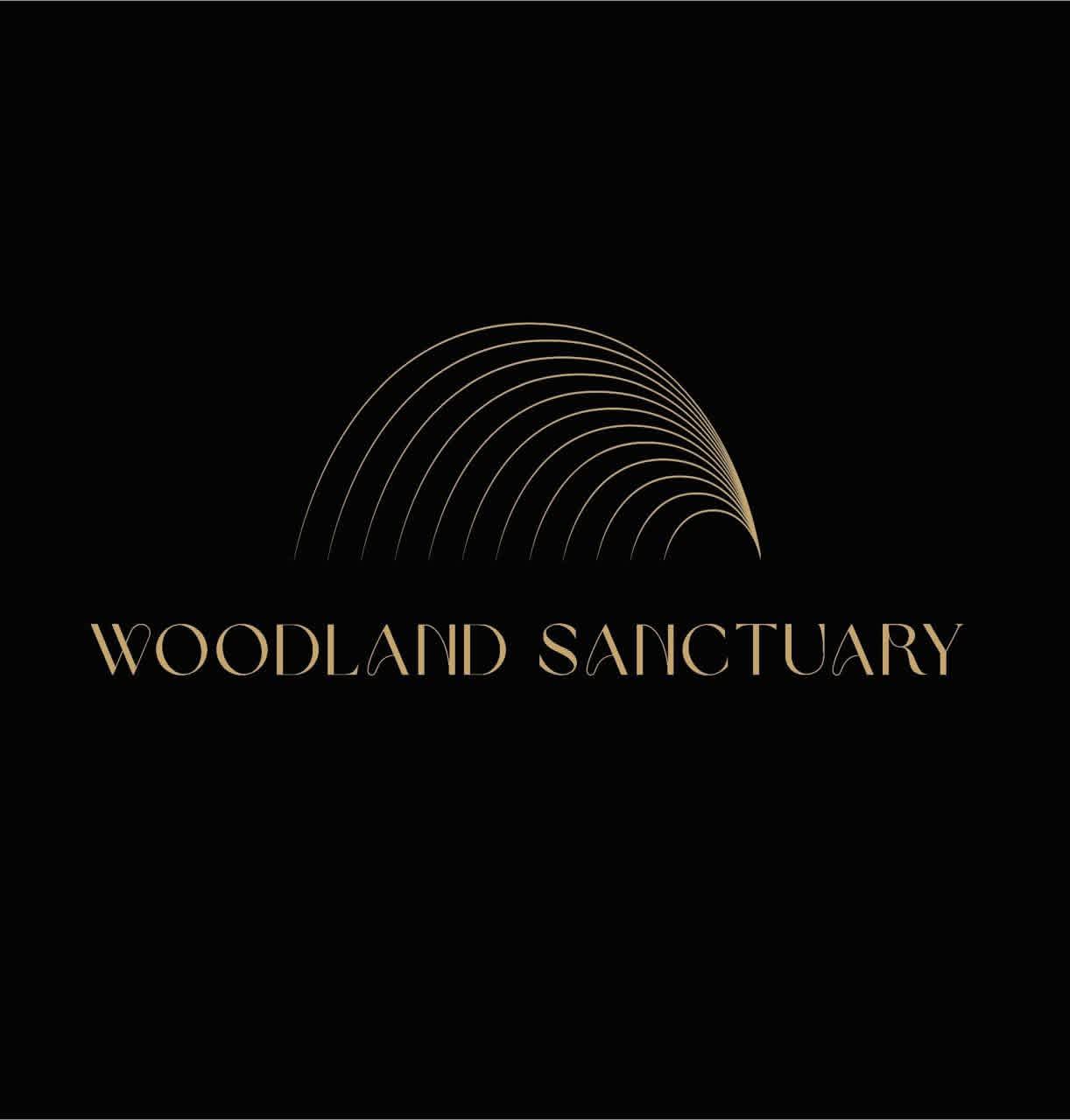
Concentric arc logo
Designed a concentric arc mark that evokes dawn over a forest canopy - organic, balanced, and unmistakable. The form communicates both natural shelter and premium refinement.
Gold-on-black palette
Developed a restrained palette of gold on black that whispers luxury rather than shouting it. Every color choice reinforces the perception of exclusivity and quiet sophistication.
Comprehensive brand system
Created detailed brand guidelines and responsive logo variations for all applications - from room signage to digital booking platforms. Consistency across every guest touchpoint.
The Result
Premium positioning.
Discerning clientele.
The refined identity elevated Woodland Sanctuary's perceived value, enabling premium pricing and attracting a discerning clientele who expect sophistication at every touchpoint. The brand now commands the same level of respect as the experience itself.
"Luxury is not decoration. It is the absence of anything that should not be there. We designed Woodland Sanctuary's identity to feel like a deep breath in the forest - effortless and unforgettable."
- Aurbyn approach